Category Archives: Jazz

Magazines – a love story

I am a magazine subscriber.  I look forward to the magazines dropping through my letterbox on a monthly basis.  I notice when they do not arrive, I fret when they are late, and in one case, where the publication is intermittent I check back for updates.

12

This may appear a little old-fashioned, but to me it makes perfect sense, the tactile nature of a magazine in print makes it more than mere content.  Being a Digital Marketer these days I read the online versions and I use Flipboard and other apps to feed me news, but in some cases a physical magazine is just what is needed.  I Have an emotional engagement that is not just about content with magazines.

A question you may have in your minds is: why on earth is Paul rattling on about magazines?

A fair point.  I recently gave some of my collection away;  As regular readers of my blog will know I have many passions in my life, my family, Rugby League (my beloved Workington Town RLFC) and art.  Art has been a long-time passion and interest, I love learning about art just as much as I do looking at it.

Splitting time between my two homes meant it was sensible to rationalise my collection.  I gave away my Tate, Contemporary, and Modern Painters magazines, carefully curated over the last 15 years.

This was a positive decision I donated them to my local college, South Staffs College in Lichfield, as a resource for their Arts Students and they were very grateful – I hope the students have found them helpful.

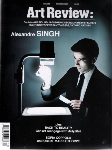
I have hung on to my Art Review magazine collection though, its was too much to give that away – it’s nearly 20 years of my life !

So when my latest issue of Tate magazine arrived at the weekend I rediscovered the joy of receiving a new magazine, topical, beautifully printed as all art magazines are … it reminded me of the power of print.  My kindle and iPad are awesome tools, but a mug of coffee and  magazine with soothing jazz on in the background really eases away the stress and strains of a busy day.

I think I need to remember this in my day job, we are about to embark upon an intense period of press advertising, largely in magazines, so the care and craft we need to put into these ads should reflect how people feel about a magazine that occupies a place in their home.

I think that is a crucial point, a magazine lives in many rooms, its eminently transportable and Magazine publishers who are successful do, I believe, recognise that privileged position.  Thinking about what I have written rationally for a moment, I have allowed those magazines to live on in my home, and so the advertising within them, for many years… now that is some decay curve !

I might be a modern Digital Marketer, I might take my kindle on holidays instead of a book, but I will continue to subscribe to magazines !  It is interesting that magazine circulation stats are now amalgamated; Digital and Print.  I hope that means that print’s stock rises again, it has never waned for me.

I currently subscribe to:
Art Review
Tate Etc
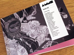
Ammo ( – that’s illustration not guns!!)
Marketing Week
AdMap

I Buy:
Amateur Photographer
Print Isn’t Dead
Jazzwise
Rugby League Express

Paul
07 June 2015

Art-Review-Issue-55-Tapa

Tagged , , , , , , , , , , , , , , , , , , , , , , , , , , ,

Top 5 current TV ad soundtracks

There are a glut of great TV ads on air in the UK at present.

The following list is my personal selection of ads truly enhanced by their soundtracks.

In the best Miss World fashion, they are, in reverse order:

Number 5 – Asda – Gavin the Gnome

I believe the marketing press about this ad – this is a real ‘marmite’ of a TV commercial, I accept that it will be enjoyed or will irritate in equal measure.

It’s an ad poking fun at Sainsbury’s and Tesco (in the form of gnomes!) and how ASDA go one better – they beat prices not match them.

The Guardian did a review of this recently and expressed disappointment (I’m being nice).

I think they missed the point. This ad is not about acquisition of new customers, this is a reinforcer and Shaggy and Mr Boombastic meet that criteria nicely I think. The current ASDA shopper is likely, more than likely I think, to enjoy this, and have a laugh rather than reject it as a bit strange… ok I do accept a gnome called Gavin in a Mankini is actually strange .. but I think it’s a great ad that neatly differentiates ASDA with its existing customers.

Good on ASDA for being brave and not telling me their bread and bacon is cheaper now than it used to be.


Number 4 – IKEA Beds


This is a gorgeous ad.  Fact.

It’s a bit weird, but I like weird, the voiceover is matched perfectly to a soundtrack that one minute in starts to pump up the volume and the drama. The voiceover is wonderfully coordinated with this soundtrack – it’s a rousing poetic masterpiece … I give you the intro;

“As I foretold you, were all spirits and
Are melted into air, into thin air:
And, like the baseless fabric of this vision,
The cloud-capp’d towers, the gorgeous palaces …”

Love it ! Well done IKEA, oh and by the way the CGI is truly stunning too.


Number 3 – Avis


“Lets go fly a kite” from Mary Poppins is the soundtrack and it works so well with this fabulously shot monochrome epic.

No words in the ad, but the use of a car remote unlocking cars around the world with the characteristic ‘blip blip’ is all the voiceover needed to support the proposition of ‘Unlock the world’.

Great art direction, and a quirky, unexpected soundtrack that softens the stark, high contrast, black and white photography … I am a little bit in love with it ! i have a feeling the ‘Musical Theatre’ fans in my family will be surprised and shocked by such an admission, after all it is not Jazz is it?


Number 2 – National Express

A lovely ad for the Instagram generation, just look at those 70s muted tones so redolent of Kodachrome and Ferraniacolour.  Silver Lady by David Soul drives (sorry, bad pun) us along on the journey very confidently.

Just a lovely lovely ad.

The words match the brand essence (ok I know the buses are actually white). I am not a big fan of David Soul but using him as the visual narrator as well as his soundtrack, and using him as at 2014 is bordering on genius as it lends much greater credibility and realism, which you feel must support the brand essence here.

A really lovely feeling ad, that brings home the growing anticipation, inherent in travel, of arrival at home and with loved ones.

A nostalgic treat !


Number 1 – Southern Comfort

This is another ad reliant, like Avis, on soundtrack and visuals. I had to check out the song … It’s “Love me” by The Phantom. A 1958 track.

I adore the coherency (sic) of the opening lines and the idea of sipping a Southern Comfort and lemonade (heavy on the ice please !!).

“Aahh, uhh, let’s go! Uhh
Press your lips to mine”

Then straight into “I can’t wait”.

Awesome choice of track, simple as!

The urgency and driving soundtrack is married to a great piece of art direction I think, like National Express, there is a great Instagram feel about the colours and the style is achingly cool with a slice of humour thrown in to boot.

This is so good I downloaded the track !


There you go … that’s my current top 5 soundtrack enhanced UK TV ads … any alternatives? let me know in the usual way!

Paul
14 July 2014


Tagged , , , , , , , , , , , , , , , , , , , , , , , , , , , , , , , , , , , , , , , , ,

Biz Stone says creativity is a renewable resource

Biz Stone the co-founder of Twitter spoke last thursday at the LSE.

I was fortunate enough to attend with two colleagues. Carl and Holly agree this was joyous, inspiring two-hour master class in storytelling with relevance beyond just Twitter.

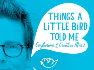
The story of Biz’s creative approach to business is truly inspiring. He is both a very nice guy and acutely self-aware; a rare and powerful combination. I picked up a copy of his new book “Things a little bird told me” on the day and I’m looking forward to reading it immensely. I just need to finish a book on Social media and customer service first!

biz-stone-book-cover-crop

There were many memorable soundbites from Biz, but the one I liked best is “Creativity is a renewable resource”.

I strongly agree with this sentiment.

In my day job creativity is crucial , we are trying to do things differently, to change the paradigm for the good of our members and our business, so I have to apply my creativity in no small order.

I have always viewed my creative thoughts as in need of a boost every now and again. My two tips for anyone in the same position are :

  1. know yourself and, or,
  2. find something completely inspirational that works for you, that inspires you to greatness.

I know myself well enough these days, at my age, I should, and I know that I am more creative early on in the day.  I am an early starter and work late, so I try to assess creative briefs and treatments first thing in the morning, when I am free of interruptions and can stick my iPod on and listen to some soothing Jazz while I think and develop my ideas. With a big mug of builders tea I might add!!

That is not always possible though, so over the years I have made a point of letting my team know when I like to do this work, the current team, like my old teams have soon got into the habit of leaving me hard copies to review in the morning … the joy of being a reflector I guess. The key to success here is agreeing with the team timelines that work for everyone.

So what have I done about external inspiration?

Firstly I try to get out of the office, it’s too easy to sit inside with a sandwich and brood – the result for me is diminished focus on creativity and increased focus on email – not the desired outcome.

So what do I do when I go out? Well these are my tips, a city guide if you like that works for me, with a little about why…

Leeds
I was fortunate to work on the Headrow initially and then Lovell Park Road … a short step to the Henry Moore Institute or City Art Gallery from The Headrow – I love the sculptures: the hard work aligned to pure creativity always inspires. Lovell Park Road was equally easy … a wander to the end of the car park to look at the concrete (no laughing, you all know me by now and you do know that  I like a bit of concrete) in this instance its the form … the regular patterns in the underpass on the ring road, the scale and importance the solidity has. Well it works for me !!

A58(M)_Leeds_inner_ring_road_from_Woodhouse_Lane_bridge_-_DSC07681

Halifax
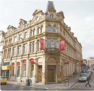
Two or three sources of inspiration in this old industrial town. The architecture in Calderdale is wicked, really underrated and looking up, above the tatty modern shop fronts, will give you a turn of the century treat. The fabulous little Dean Clough Mill art gallery … a maze of corridors and little rooms on different floors that force you to turn your mind to what you are looking at, you get lost in the art. My favourite place though is the Piece Hall, it reeks of Industry and socialist aspirations. If a Brass Band is playing even better : the full Brassed Off experience is much underrated. Brassed off remains one of my favourite films by the way.

Harveys of Halifax your_pics_halifax_piece_hall_mike_glover_02_400x296

Douglas
No contest – a trip to the sea front, and a look down at the road. Ok, that’s odd I know, but the Isle of Man was an Intern Camp for non-British Nationals during WWII and outside of the Sefton Hotel you can still see the remaining holes where the wooden fence posts were rammed into the ground. That just puts everything into context, the creativity exhibited by those interned was wonderful and is always an inspiration, mind the horse-drawn trams though, the stopping distance is not as controlled as a car!

The_Sefton_Hotel_and_Gaiety_Theatre_-_geograph.org.uk_-_416670

Manchester
Not my favourite city, I will admit, but two things always inspired me – the CIS tower on Miller street where I worked – a wonderful, great big modernist box of a building. But if regularity didn’t work I went to the Chinese Art Centre in the Northern Quarter. Green tea and some truly challenging art. The people were amongst the loveliest gallery staff I have ever met too.

CIS tower showing plinth

Edinburgh
The Victorian Palm House at the Royal Botanical gardens – a real hidden treasure. An art gallery in the gardens, a park opposite with some excellent street art on the buildings and two Rugby Clubs within a mile – who wouldn’t be inspired

0_buildings_-_palm_house_west_side_029283

Glasgow
A shot hop from where I worked was the Glasgow School of Art – the whole building was just so beautiful, I hope the recent fire has not damaged it too much. Below that was the Glasgow Centre for Contemporary Art (CCA). A great place to eat, drink and check out some challenging modern art. The show Angel Camp: First Songs by Emanuelle Antille (Aug 2004) remains my favourite art show ever.

the-glasgow-school-of

Lichfield
It has to be the cathedral in the town where I currently work … A huge Gothic 3 spired masterpiece – I love walking around it.

These are not all the places I have worked, who knows if you ask I may share even more, but these are my personal places of inspiration, I know you will have your own, if you can, add a comment or two on what inspires your creative mind.

Lichfield_Cathedral_East1

Paul
23 June 2014

Tagged , , , , , , , , , , , , , , , , , , , , , , , , , , , , , , , , , , , , , , , , , ,

Great customer service … with honour!

I posted the other day about Manchester United and their proposition and positioning.

It reminded me of a stunning, and quite original, positioning that I came across almost by accident.

Those of you who know me will know certain things about me;

  • I love concrete and all things modernist and brutalist in architecture
  • I firmly believe that Roadhouse is the finest film ever made (with lessons for life in every scene)
  • I only really listen to Jazz
  • One of my favourite brands is Wilkinson’s
  • One of my favourite logotypes is Norfolk Line – lovely combination of type colour and design
  • … and I drive up and down the A14 most weekends to get home

All of which you are likely to know .. but the last 3 in that list have a connection … lorries, and in particular advertising on lorries.

I posted about this some time ago, I may be becoming a lorry geek!

By now reader, you are wondering what on earth this post is going to be about … well lorries… and a proposition …and a surprise;

Allow me please to introduce Knights of Old .. in fact the Knights of Old Group.

If you drive around the Midlands in the UK you will know their haulage. It states boldly on every lorry “SERVICE WITH HONOUR” I really like that, its bold, it’s certainly original and I don’t know much about haulage and logistics, but I bet it’s a USP !

splash

Check out the values on their website … here

This is a roll call of ambition, style, and growth. Mission statements may be a little old hat these days, much derided thanks to too much pomp and ceremony from Management Consultancies in the 90s (just my opinion you understand), but in this instance it absolutely backs up the vision and it must by its nature and presence unite a workforce that is by its nature dispersed geographically.

The typeface is also crucial in lending credence to such a nice line and vision. Can you use an old-fashioned word like ‘honour’ with a modern san serif typeface? I don’t believe you can, at least not for this brand.

And the surprise?  Well it is their website, a quite lovely piece of story telling across the piece. The rolling banner points you at three different stories and, my, how well they present them, especially the photography.

Can you make logistics sexy? You bet you can, especially with as clever a use of brand association as I have seen for a very long time, John Lewis, Carluccio’s anyone? … lovely!

Check it out here

But maybe I should not be so surprised at the quality of their advertising and marketing … look how they promote the cycling team they sponsor – very nice!

SKOO

One final point to make as well. Added to my list at the top of this post you could have added I love brand heritage stories .. some brands lend themselves to it … Co-operative please note … why do you not embrace yours? … and this is one such brand. The history is well presented, not over done and it contextualises the whole vision. Very nice indeed

Read it for yourself here, its worth a few moments of your time I believe.

The story telling explains the origin of the company name and the use of the “Knight” and “Old”. The company was founded in the village of Old (near Kettering) by William Knight. It’s interesting to ponder how different their brand proposition might have been expressed if the two names had not worked quite so well together.

I hope you have enjoyed this slightly offbeat post, I find it really refreshing that a brand in such a non glamorous industry can make such a bold creative play but I guess you would expect that from a brand with such confidence to paint its proposition on every Lorry!

You will also be pleased to know you can buy toy lorries ‘a la’ Eddie Stobart too … I may seek one out, one on my desk would remind me that delivery of great service is important whatever industry you are in … and if you can do it with honour, even better.

20100825110849-ty86611-knights-of-old

Paul

01 May 2014

Tagged , , , , , , , , , , , , , , , , , , , , , , , , , , , , , ,

Cider Beer comes over all creative

After a short summer break, driven in no small part by getting to grips with a heavy workload in my new job, I hope to get back to posting more regularly again – so here goes ! 

The prompt to post again has been a significant shift in beer advertising creativity – normally I prefer drinking it to looking at advertising of it, but a few executions have recently caught my eye – all of them for Cider.

Lager beer has been the beneficiary of great advertising over the years, from Skol to the Hofmeister bear and more latterly Carling and the new bottled lagers like  Beck’s – my Lager of choice – and Peroni.

But Cider, well that was three arrows banging into a bar wasn’t it.  Great consistency but not a sustainable brand image/presence for the category, and not one that lends itself to growing sales in new target sectors – it was a real solus play.

But the last 12 months or so has seen a veritable explosion of really great Cider advertising.  The end of 2011 / start of 2012 saw the balance tip … Lager sales, long in decline, were overtaken by Cider sales.  The increased sales, and so a larger market mean one thing to a brand … exploit the growing market, in the case of cider this means advertising to maintain your share e.g. Bulmers and Strongbow and a chance to enter the market with a distinct identity like Sommersby and Stella’s Cidre or a chance to reinvent yourself to grow share like Magners.

Mintel’s report makes interesting reading – have a look here. 

It is always interesting to see a category raise its game in advertising terms, the growing market size sees a flight towards it in talent terms and bigger ad budgets mean grander propositions and higher calibre agencies handling above the line activity with greater care.

Lets look at just a few:-

Bulmers – a great heritage play … I really like this and have posted about it before, the activity this year has been focussed on outdoor – great impact from the 48 sheet – I love how they have left it uncluttered !

A2GqAZdCUAAvF34 Bulmers-New-48-Sheet-April-2013-Compressed 

Sommersby – a really likeable spoof of the excitement that surrounds the launch of a new Apple device – its really clever and very knowing … Apple vs apples – very good!

Stella – Cidre – this is a typical eccentric Stella Ad, very stylish and aspirationally cool – a nice fit to the icy cold cider drink. The idea of a presidential launch is fun and the hero creation around the chalice implies a reverence you could not get away with on any other brand I would contend

Magners – I love this faux Guinness ad and have posted about it before … great warmth and charm – I remain convinced a night our with the protagonist would be fun !

Westons – a new entrant, on TV at least, and old-established brand but playing a heritage card through its TV advertising of its Stowford Press brand… and doing so very well indeed.  They have TV running in Estonia (as a useless aside) and have targeted Jazz festival tie ups in their sponsorship activity – a tightly defined group – the Cheltenham Jazz festival sponsorship looks great as does their tie up to English cricket which is well executed in Social media 


I think this shows a body of work alongside the Carling entry and Strongbow reinvention that is second to none currently.  

I might even try a glass of cider next time I am out !

Paul

03 August 2013

Tagged , , , , , , , , , , , , , , , , , , , , , ,

My Marketing Valentines

Given the date I think its time I shared a few of my design and marketing loves on my blog.  Valentines day is a suitable day to celebrate some of the loves of my creative mind …  you, the reader, may well feel you know me a little better if you have read a few of my blogs, so I’d be interested if any of my selections surprise you.

I_heart_marketing

It does feel like a few words of explanation are needed before I get into my top ten;

  • It’s not a straightforward top ten, it is more like a 21st century version of a mix tape
  • It mixes brands, type, design and more, but all are creative related and I have a genuine love of all of them
  • These are my top ten .. In any order you like, split across two blogs to keep you guessing (ok and keep it short and readable as well !)

Right, now that’s out-of-the-way, here we go with Pt 1 – my first 5…

ILFORD LOGOTYPE

Ilford logotype

Ilford logotype

I adore the beautiful simplicity of this logo, its simply always stayed the same.  The font is Futura Extra Bold I think.  Its been consistent for years and has lovely clean lines … always black, usually on crisp white, which given the company focus on B&W film is entirely appropriate.  It just sums up my early photography experiences.  I love it.  Always have.  Always will.

TRANSPORT MEDIUM FONT (as used on UK road signs)

Transport font

Transport font

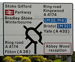
This is one of those familiar types that is now so common that it almost passes you by, if you will forgive the pun.  It is wonderfully clear, so very legible, and works with a  variety of backgrounds.  It is so startlingly easy to read that I can absolutely understand why it is used and why it has endured so long.  Kinneir and Calvert the designers made the font to enable readership of the words/names to be completed quickly.  The fact that it is so attractive is a happy by-product for us all.  Motorway signage in “Motorway” font by the same designers is only slightly less lovely in my view.

Wikipedia entry on Transport typeface

LEICA CAMERA DESIGN

What I love about Leica is the unashamed confidence in its own design aesthetic and principles.  The cameras are fabulous to use, I own quite a few in my collection.  My favourites are the pre and postwar Leica rangefinders.  They epitomise solidity, luxury and function, all in a quite wonderfully proportioned body.  They have always been a luxury camera, they have always been resolutely faithful to their design beliefs and considered by some to be constrained by their design and resolve to stay close to their heritage.

1955 Leica IIIF red dial

1955 Leica IIIF red dial

They have made great SLR cameras as well … but just look at a Leica IIIF red dial, or IIIG or M6 or the latest digital Leica.  Stunning looking designs that also perform to the highest standards and do so whilst looking genuinely tactile and absolutely beautiful.  Leica as a brand to camera enthusiasts comes very close to the cult status Apple enjoys today.  Which brings me to …

APPLE specifically my iMac (but equally my iPhone, MacBook and iPad) BRAND

My iMac looks beautiful, it is solid, confident and with a lightness in design that makes me forget the aluminum case is so heavy – I found out just how heavy when taking it to my local Apple store for a replacement hard drive recently.  Leaving my iMac was hard .. I had to plan the visit and time it properly … and yes, I do know this makes me sound sad, I do have a life honest.

A quote from Simon Sinek in his book “Start with the Why” sums it up nicely for me:

“Their products unto themselves, are not the reason Apple is perceived as superior; their products, WHAT Apple makes, serve as the tangible proof of what they believe. It is that clear correlation between WHAT they do and WHY they do it that makes Apple stand out.  This is the reason we perceive Apple as authentic. Everything they do serves to demonstrate their WHY, to challenge the status quo.”

Simon Sinek on TED Talks

A long quote I know .. But I like it.  I’m typing this on my iMac on Apple software and that makes me happy.  On reflection, another reason it makes me smile is because I estimate I know only a good third of what my iMac is capable of and that’s after a good few years use.

ECM (record label) DESIGN and BRAND

ECM website – company history pages

This is a close as I get to cool I am afraid.  ECM was founded in 1969 by Manfred Eicher.  ECM stands for Edition of Contemporary Music and as a music label it does just that.  I came across it through my love of contemporary Jazz, and Tomasz Stanko in particular, at the CCA in Glasgow in the late ‘90s.  I bought the CD, Suspended night, and was blown away by the album and the design principles the label follows.  The website is clean, minimal and packed with concise, clear information – just like the CDs themselves and in some cases the music too.

The cover art is stunning in its simplicity and appropriateness to the music is prefaces.  The fact that the label hosts Steve Reich (a new love following an introduction by a friend) and Manu Katche, EST, Tomasz Stanko etc (some of my favourite jazz artists) is a happy coincidence, even if they stopped recording those artists I would still love this serious, adventurous and ‘cool’ brand.

TS simple album cover


Well, that’s Pt1 completed … let me know what you think so far please, Pt 2 to follow in due course .. oh and Happy Valentines day !

Paul

14 February 2013


Tagged , , , , , , , , , , , , , , , , , , , , , , , , , , , , ,

The new age of Jazz Marketers

I am a Jazz fan.

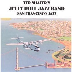
My late uncle Cyril was a superb Jazz pianist and played with some of the greats when living in the US during the 60s and 70s he was in Ted Shafer’s ‘Jelly Roll Jazz Band’.  I’m not sure when I first became a real fan, I’d seen Cyril play, and I had even had some chats with the guys in the Manx Jazz Aces when I lived on the Isle of Man, and I had heard some Don Cherry thanks to his daughter Neneh and my love of Rip Rig and Panic – a Jazz Punk fusion band.

Cyril B on piano

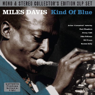
In fact it was on the Isle of Man in the Late 80s that I bought my first copy of what is still my favourite album; “Kind of Blue” by Miles Davis.  45 minutes of sublime modal Jazz.

Kind of Blue _ my album cover

I bought an album, a long player, some vinyl, a record – from a secondhand shop just off Douglas promenade.  It smells just like all my other vinyl albums, it smells like a record, it smells like music.

It’s substantial in weight, the imagery is bright, colourful and the font is big enough to read comfortably.  It has substance.  I love the physical album almost as much as I love the music.

In fact I have it on CD now as well.  And I ‘streamed’ it while doing some work on my Mac the other day.

But I love the album, seeing it now always reminds me of the emotional nature of buying albums.

This pleasure may not be known to some of you for much longer though, despite a small nostalgic bump up in vinyl sales in the middle of 2012, the figures speak for themselves:

  • UK album sales dropped by 11.2% in 2012
  • CD sales declined by 20% to 69.4m in 2012
  • There are approximately 300 independent record shops in the UK today, down from 2,000 10 years ago
  • 99.6% of singles sales in 2012 are via digital download
  • Digital downloads of albums rose 14.8% in 2012 to over 30m
  • Chrysler in the US is launching “Uconnect” – a wi-fi music streaming and app facility for in-car audio – so I can listen to Kind of Blue yet another way !

http://www.driveuconnect.com

The ability to see and feel albums is slowly leaving us, that’s a bit sad.

This trend to buying the incorporeal and invisible peaks at Xmas and for me the above stats together with the few below are the most interesting I have seen for a while … and they give me hope … more of why later:

  • Experian, the data specialist, report that there were 113m visits to retailers websites on Boxing day 2012
  • There were 107m visits on Xmas day which is up 17% you

Now I know this is driven to an extent by sales and our current economic situation, but there is clear customer insight here:

Customers are happy with the channel, sure, but more importantly they are now happy buying without the product needing to be tangible, so long as the benefit to them is clear, be that price, or convenience or whatever.

This reassures me why?  Well this has long been the challenge when marketing financial services.  Our products offer a real benefit but they are almost unreal.  Your car insurance, for example, boils down to a piece of paper (I exaggerate to make the point), but it’s so much more than that; it protects you, offers you a chance to manage your expenses by shopping around, it gives you peace of mind in case of ill fortune.

But in physical reality .. It’s your motor certificate, which you mostly only need when getting your road tax.  In 2011 the 50% barrier was breached and 51% of UK motorists taxed their car on-line and around 75% of us shop around for Car Insurance on the web.  You see my point?

The reassurance I feel is that as more marketers move away from a reliance on the physical this will open even more digital doors for financial services.  These lower cost channels represent an opportunity to reduce costs and to optimise the customer journey in a way that makes it feel more like those retailers 113m of us visited on-line over Xmas.

It will up our marketing game as well, just think of all the inspiration we will get, but much more importantly, it also levels the playing field.  The physical estates Financial Services Companies used to rely on will become less and less important when every brand is potentially only 1 click away with a  mouse, or a finger.  That has to be good for consumers in terms of transparency and choice when completing the actual purchase.

In 2013 and beyond I need to treat my day job just like I treat my Jazz listening;  I might occasionally savour a journey with Miles on the turntable, but when I am in a rush I might choose the convenience of the CD, and increasingly if I am working on my next blog … I’ll maybe stream him to my iMac.  I must remember that this is exactly what my target customers are doing too !

The final, reassuringly good, news is that all these routes exist because I, the customer, see the benefit in them, and as long as I continue to see those benefits, no doubt they will remain…. And whose job is it to make sure I see the benefit?  You guessed … that would be the role of Marketers !

Paul
13 January 2013

Sources;

http://bpi.co.uk
http://Experian.co.uk/business-services
http://bbc.co.uk
http://DVLA.gov.uk

http://www.manxmusic.com/performer_short_129290.html

manx jazz aces

Tagged , , , , , , , , , , , , , , , , , , , , , , , , , , , , ,